
An app that barely worked
kip started with an app my wife and I actually used. It barely worked. Getting anything into it took more taps than it should have, and the design was rough enough that using it felt like a chore you squeezed in between the real ones.
We kept using it anyway, which says a lot about the idea. Having one place where the people looking after the same little person can see what already happened is useful. When you're tired, "did someone already do this?" is a real question, and an app that answers it is worth putting up with, even a clunky one.
That stuck with me. The idea was good, and it deserved to be built better, and to look like something you'd want to open at 3 a.m. instead of something you had to.
I said what everyone says: I'll get around to it when I have time. For a long time I didn't. Then I did, and kip is what I made.
I suspect a lot of projects start this way, with something you put up with every day. The annoying parts show you where the friction is, and the fact that you keep using it anyway tells you the idea is worth saving.
Twelve pages that never quite explained it
kip is a concept: a baby log for the whole "village" of people who take care of one baby. Parents, grandparents, a nanny, a night doula, the pediatrician. Everyone logs feeds, sleep, diapers and medicine in one shared place, and every entry shows who logged it. There's no real app, no accounts and no stored data, and the site says so.
The first kip site I built had twelve pages. Home, the village, insights, a tour, pricing, an FAQ, and more. Every page was fine. Together they made you work to understand something simple. The idea of kip is that a lot of people share one small life, and twelve pages split that into twelve pieces.
So the new site is one page, and the top of it is a house.
Why a house
A house is where the village actually meets. So every room became one feature:
- The entry is roles and handoffs. Ari, the mom, hands baby June to Grandpa at the start of his shift.
- The living room is milestones. Nana caught June's first smile.
- The kitchen is the shared log, and the moment it catches a mistake: Rosa, the weekday nanny, is about to give a vitamin D dose that someone already gave.
- The nursery is 3 a.m. mode. Open it and the whole scene turns to night while Jo, the night doula, does a feed.
- The study is the pediatrician report. Sam, the dad, shares it with Dr. Patel.
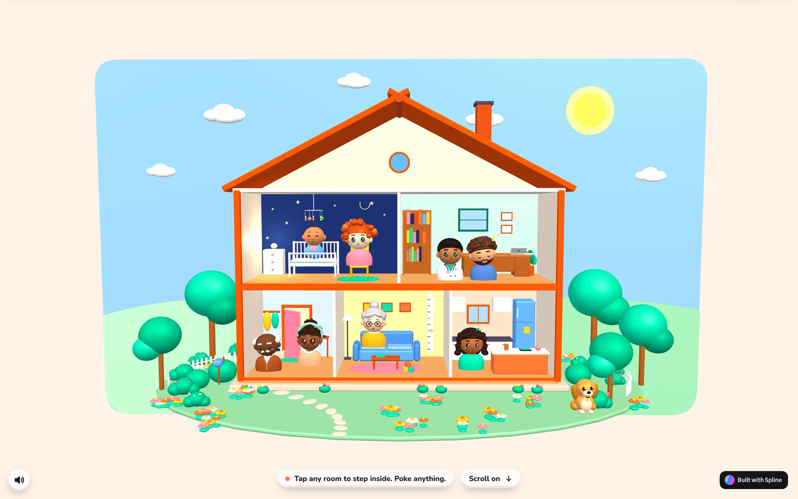
The whole house. Every room is one feature, and every character has a job.
I had one rule for the layout that I didn't break: the characters are always fully visible. Furniture goes behind them or beside them, never in front. The first version had a shoe cabinet across the front of the entry and a desk in front of Sam, and both had to go. A family app should look like it's about the people.
The cast came first
Before the house, there were the people. Eight of them, plus Biscuit the dog. I built them in Spline from simple shapes, spheres and rings and curves, in a chibi style: big heads, big glossy eyes, blush, a soft pastel circle behind each one.
Every character has a different skin tone and a different eye color, because a village is never one kind of family. Every one also has a face rig with a set of expressions that play on a loop: blinking, happy, surprised, flustered, sleepy. Tap anyone and they light up.
Getting them right took rounds. Sam's collar went through three versions before a plain crew neck finally looked like a shirt instead of a costume. June's first version had the same body as the adults, and the honest feedback was that she looked like "a grown up with a baby head," so she got a round onesie body with no neck. Dr. Patel's stethoscope was too short to reach his ears. Those are small fixes, and they're the ones people notice first.
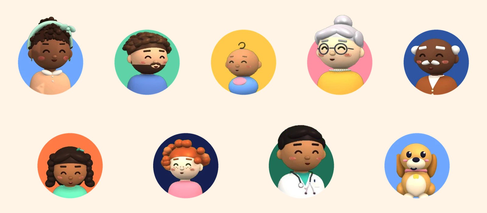
The whole village: Ari, Sam, June, Nana, Grandpa, Rosa, Jo, Dr. Patel and Biscuit.
One trap worth knowing if you build characters this way: copying an object in Spline keeps it linked to the original's material. When I copied Sam's rig to start the next person and recolored the copy's hair, Sam's hair turned silver too. His shirt turned yellow the same way. The fix is to give the copy fresh materials before you change any colors.
Making a scene you can play with
The house does a lot when you touch it:
- Rooms focus when you tap them. The camera eases in, the other rooms dim, and the characters' speech bubbles pop: "See you later, Grandpa!", "Good catch, kip!", "Shh… 3am feed."
- The phone that slides in shows the real app screen for that room, and it works. Log a feed, start a shift, add a milestone, build the report.
- About 88 objects react on their own. The crib mobile spins. The front door swings. Tap a tree and it sways while a robin flaps out and flies away.
- Sound is soft and made in code without audio files: little pops and a quiet lullaby, with a mute button.
The camera leans a little toward your cursor. I tried a full orbit, where you can drag the house all the way around, and it was worse. The house is designed to be seen from the front, like a stage. A little wiggle makes it feel alive. A full spin mostly lets you find the back of things nobody designed.
That small-loop thinking is the same idea I wrote about in Thirty seconds of fun. Tap, something happens, you want to tap again. Nobody needs a robin in a baby app. Everybody taps the tree twice.
The six things that broke when it became a website
Inside Spline's editor, all of this worked. Then I put it on a web page with Spline's viewer, and one thing after another stopped working. Each of these looked like "nothing works" at first and took a round of debugging to name.
1. The scene swallowed every tap. The phone screens and buttons I'd built inside the scene run in a layer that sits over the 3D canvas. In the editor, taps pass through that layer to the house. On a web page they don't, and nothing I tried on the layer let them through. The fix was to make that layer ignore taps completely and rebuild the phone, the mute button and the room captions as part of the page itself.
2. The scene couldn't talk back. Once the page owned the phone, the page needed to know which room was open. Messages could go into the scene, but messages back out never arrived. Spline has variables, though, and the page can read them. So the scene writes the open room into a variable, and the page checks it.
3. Sound needed the page. Browsers only play sound after a person interacts with the page. With the scene's layer ignoring taps, the scene never got that permission. So the scene writes which sound it wants into a variable too, and the page plays it.
4. Taps landed where the house used to be. On the page, the house starts as a card under the headline and grows to full screen as you scroll. Spline measures the canvas once and remembers where it was, so after the house grew, taps were aimed at the old small card. The page now re-measures it after every move.
5. Some browsers drew half a house. On Windows Chrome, Spline used the browser's newer graphics path, WebGPU, and quietly skipped about 230 draws: the sky, the roof, the walls and Nana. No error, just a house with no walls. Forcing the older WebGL path fixed it, but the obvious way to do that broke taps again (of course), so a tiny script adds the setting to the page address while the scene loads and removes it after.
6. The scene started listening late. The scene's code comes up a few seconds after the page loads, so anything the page tells it right away gets lost. Now the page repeats its state about once a second. Cheap and dull, and it works.
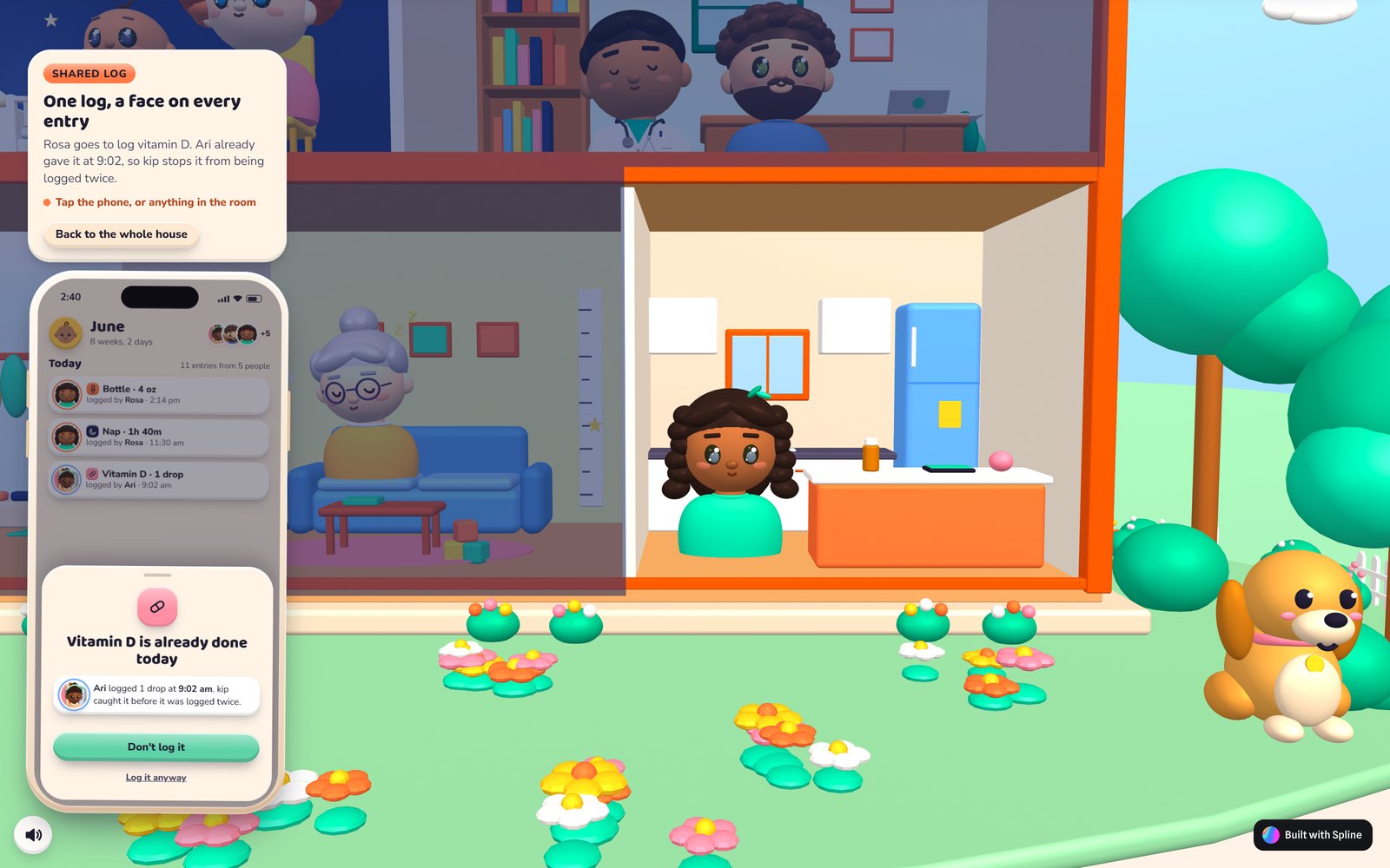
The kitchen, open. The phone on the side belongs to the page rather than the 3D scene, which was fix number one.
All six fixes point the same way. The 3D scene is good at looking good and reacting to touch, and bad at the jobs a web page does. So the page handles the controls, the sound, the layout and knowing what's going on, and the scene draws the house.
Phones: the tall house that didn't work
My first phone version did what seemed obvious. The house filled the whole screen, tall, and you tapped rooms right on it.
I tested it on my own Android phone and it was bad. A house is wide and a phone is tall, so filling the screen made the house tiny, with a lot of sky above and lawn below. The rooms were too small to tap reliably. And because the canvas took every touch, you couldn't scroll past it. Your thumb was stuck playing with the house.
The version that shipped turns that around:
- The house is a wide card pinned at the top of the screen, short enough to leave room for everything else.
- A row of room buttons sits right under it: Whole house, Entry, Living, Kitchen, Nursery, Study. On a phone, these drive the house. The 3D canvas ignores touches, so swiping scrolls the page like a person expects.
- The app phone slides up from the bottom and takes the rest of the screen.
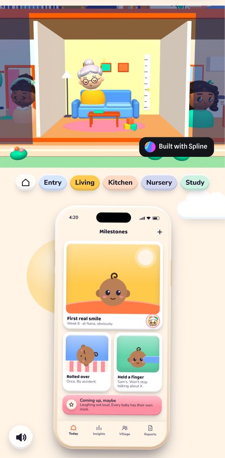
On phones the room buttons drive the house, and swipes scroll the page.
That last part is the Tap is not hover idea again, from the other direction. On a phone, a tap is a lot of things at once: a click, a scroll, sometimes a zoom. A 3D canvas that claims every touch makes the whole page harder to use. Buttons are boring, and they work on the first try.
Making it light enough to load
The first full house was heavy: about 2 million polygons. That's a lot of geometry to ask a phone to draw over and over. Most of it came from spheres and rings with far more detail than anyone could see at that size, plus each character's hair built out of many separate pieces.
The cleanup was unglamorous. I lowered the detail on 196 spheres and 61 rings and tubes, merged each character's hair into single shapes, turned off shadows on all but one light, and turned off ambient occlusion, a shading effect that was giving the whole scene a grainy look anyway. The house went from about 2 million polygons to about 760,000, and nobody looking at it can tell the difference. The night switch used to stutter the first time, so the shaders it needs are now prepared while the page loads.
While the scene loads, a branded loader and a still picture of the house sit underneath it, so the hero is never a blank box. I wrote about why that matters in my Interstellar note on waiting: a wait with something to look at feels shorter than an empty one, even when it's the same wait. And the motion stays polite. The app phone screens follow reduced-motion settings, the same way I described in Reduced motion without losing the magic.
If you've read my note on interactive 3D in Webflow, the rules are the same ones, just pushed further: load the 3D when it's needed, have something to show while it loads, and don't let it fight the page.
Showing a moving scene in a case study
One more thing broke after launch, in a different place. For the kip case study on this site, I wanted short looping clips of the house. Animated WebP is what I use for most loops here, but the house never stops moving: the camera sways and leans, so a big part of every frame changes. To get those clips under about 4 MB as WebP, the quality had to drop so low that the rooms went blocky and the phone text went soft.
The same clips as MP4 video were sharp at about 3 MB. So the case study plays a muted MP4 loop only while it's on screen, with a still image for anyone who has reduced motion turned on. WebP is still the right choice for loops where only the interface moves, but for a 3D camera that never rests, video is better.
What I'd do again
Put the interaction in the page and the visuals in the scene. Test on a real phone early, before the layout feels finished. Keep a list of what broke and how it got fixed, because every one of these six will come up again on the next 3D site.
And keep the robin. Nobody asked for it. It's the thing people show their friends.
The full story of kip, from the twelve-page site to this one, is in the kip case study. The house is live at kipvillage.com. Tap the tree.